Businesses have been using billboards as a marketing tool for several decades now, thanks to their efficiency in delighting consumers and increasing brand awareness. You could look up old photos of EDSA, and even though you wouldn’t recognize it without the traffic jam, you would already see billboards—albeit not as creatively made and designed as the ones today—perched up high along the road.
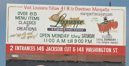
Just like any advertising and marketing strategy, outdoor advertising like billboards requires research and preparation. Failure to do so can lead to mistakes in design and set-up, reducing its success. Outdoor advertising in the Philippines is both a creative and logistical challenge mainly because of its medium and size. These factors can magnify the possible mistakes. And, since it’s very evident, the audience will notice the errors right away. Here are just a few of them:
1. Too many words
HOW TO FIX: Get your message across in as few words as possible
Just because the advertising medium is large, doesn’t mean you have to fill billboards with words. Sure, traffic is horrible in this country, but not everyone has the luxury of time to read an entire paragraph while cruising (or stuck) down the street.
Take, for example, this billboard from a BPO company, complete with a bulleted list. Although it was just a list of their office locations, not one passenger or driver would even care to remember the full addresses. You can bet they had to Google it to know.
Your message should only take a few seconds to read and understand, using not more than seven words. A short, punchy phrase is more effective for a billboard. You only have seconds to make an impact, so make it count.
2. Wrong text font and color
HOW TO FIX: Use simple and clean fronts, and choose the right contrasting colors
Another mistake is thinking that the size of the text is enough for the reader to read what is on the billboard. The first mistake you can commit is choosing a font that only looks good on paper. Not all fonts will work for a large outdoor ad—for instance, the curly, thin, or complicated ones.
And then, there’s the font color. If you’re integrating your company colors on the billboard, you need to be smart about it. A bad combination of colors does not provide the contrast that will help the message pop.
To remedy this, use fonts that are clean and simple, but large enough to be seen even from afar or at any time of the day. Be mindful of the distance between letters as well, and use colors that provide the right contrast against the backdrop. If you’re going to use special materials, consider how it can affect the readability of the signage against light and shade.
3. Grammar, spelling, and other errors in wording
HOW TO FIX: Double check the copy before production
Filipinos are not native English speakers, but it is still one of the countries with the largest English-speaking population. Suffice to say, a majority will easily notice a spelling or grammar error on your copy—may it be in English or Filipino. Misspellings, grammar mistakes, or too many punctuation marks can send a negative message of unprofessionalism to your prospects and partners.
There’s also the case of statements free from grammar or spelling errors but with a message that can get misconstrued. You may have seen this Kidzania billboard that made them look like they are into human trafficking.
More than grammar and spelling, you should also take note of the right words to use. Such errors are all too common but preventable. Hire a professional writer and a copy editor to ensure that you’re getting the right message across.
4. Mediocre design
HOW TO FIX: Do your research and ask for the help of a professional designer
You’re shelling out thousands for your billboard, so make it count. Don’t settle for designs that are good enough. Make it look as best as it can and invest in a professional designer who can mix graphics, font, color, and message into one cohesive ad. Getting professional help will assure you that all of the design elements are apt for billboard printing—no bad pixels or poor resolution.
5. Using the same design from other advertising materials
HOW TO FIX: Make sure that the design fits the medium
You understandably want your marketing and advertising materials to look consistent for branding purposes. However, not all designs translate well to larger media. If you have a brochure design that you want to adapt to a billboard, it has to be overhauled. A brochure is effective because the details are complete. You can’t do the same to a billboard.
6. Overwhelming visuals
HOW TO FIX: Focus on one idea
Another thing that you can’t go overboard with is visuals. Again, just because the canvas is huge, doesn’t mean you must fill it up. When there’s a lot on the billboard, it will tend to look cluttered, and the message gets drowned out. This is especially important if your reader is riding at 60 m/h—their eyes won’t know where to focus and they’ll look at something else more pleasing to the eyes instead.
Avoid confusion by utilizing white space. Keep the design simple and clean and use impactful statements. Just go for that one piece of information that you really need to express, and build the ad around that.
7. Bad placement
HOW TO FIX: Identify the location of your target demographic and make sure it’s visible from all angles
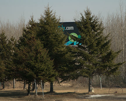
You have the perfect design, but you’re not sure yet where to set up your billboard. Placing it in the wrong location is a waste of investment. Before you even create the ad, you should already know where to put it. Go for a place where your business’ specific demographic frequently passes through so that you’re getting the right people’s attention. Carefully select other areas as well—one billboard isn’t enough.
Aside from the specific location, look at the angle of the billboard, too. It should be placed in such a way that increases its visibility. Consult with experts regarding this matter.
8. DIY outdoor advertising
HOW TO FIX: Get the assistance of outdoor advertising specialists
Short on funds but want to have a billboard? DIY is never the solution. Investing in outdoor ads requires professional guidance and talent. If experienced agencies can still do wrong, what more if you—without a background on advertising—make the billboard yourself? Save up or get the right funding so you can avoid the mistake of DIY outdoor advertising.
Make an Impact
Outdoor ads are a huge investment that, when done right, can offer significant returns. That is why it’s essential for businesses to create and set up one that is professionally made. With the right outdoor advertising specialists, your campaign will be able to avoid these common billboard mistakes, and you will surely get your money’s worth and more.
Contact Quick Brown Fox and make that billboard happen now!

Franco Alvarez is the Founder and CEO of Quick Brown Fox, an independent media group specializing in Out-of-Home (OOH) and Experiential Media strategy and implementation. With a career rooted in world-renowned media conglomerate GroupM (WPP), Franco brings a deep understanding of client needs and high-level media strategy.
At Quick Brown Fox, Franco leads client acquisition and management, business development, strategic partnerships, and revenue generation. He has worked with top-tier clients including HSBC Philippines, AIA Philippines, Pepsi Philippines, Omnicom Media Group Philippines, Sunnies Inc., and Netflix, as well as international accounts across Singapore, Indonesia, Hong Kong, and Malaysia.
Franco’s expertise spans the full spectrum of media planning and execution, giving him a unique perspective on delivering measurable results for both local and global brands. His leadership philosophy focuses on building long-term client relationships, fostering strategic partnerships, and creating innovative campaigns that maximize audience engagement.
Passionate about driving the growth of independent media in the Philippines, Franco continues to shape Quick Brown Fox into a trusted partner for advertisers seeking cutting-edge OOH and experiential media solutions.
Connect with Franco Alvarez on LinkedIn


